Redesigning pricing analytics to prevent ~$2.4Mn Annual Revenue Leakage
View deliverables
Team
1 Designer, 2 Developers, 1 Product Manager
Role
UX Designer
About the project
PENNY is a B2B product for setting prices and viewing the pricing analytics for SPOT ocean cargos. The product generates an approx $50Mn annual revenue for the organization
My role in this project was to conduct design audit, conduct user interviews & re-design of dashboard and notification feature
$1.2M leakage
Error Rate (ER) on Save/Publish
$750K/monthly loss
Due to delayed decision
15-20 mins
Task success rate
Problem statement
Our Pricing Analytics product, critical for dynamic pricing decisions in logistics, suffers from outdated UX patterns including cluttered dashboards, non-intuitive data visualizations, and fragmented workflows. This leads to $2.4M in annual revenue leakage—primarily from pricing errors and delayed decisions from Pricing managers.
User scenario
“How Might We” display an efficient pricing data visibility for ocean cargos in pricing dashboard by enabling Pricing Managers to create & manage rate structure via automated system message which will allow them to prevent revenue leakage.
Methodology used
Jakon Nielsen 10 heuristic principles
Evaluation criteria
Each task was completed in collaboration of developer, a usability expert to ensure no edge cases or RBAC scenario misses. To determine the severity, I considered three factors – frequency, impact and persistence. I scored each usability issue on a scale of 0 to 4, with 0 being no issue and 4 being severe.
Tasks evaluated
Tasks that focused on core functionalities of PENNY pricing analytics were evaluated. The goal was to identify major usability flaws within PENNY UI
- View uptake & rate curve for multiple weeks with custom filter
- Search data by region/OD/Trade
- View real-time system status and recent incidents
- Setting up pricing ladder
- View Booking summary
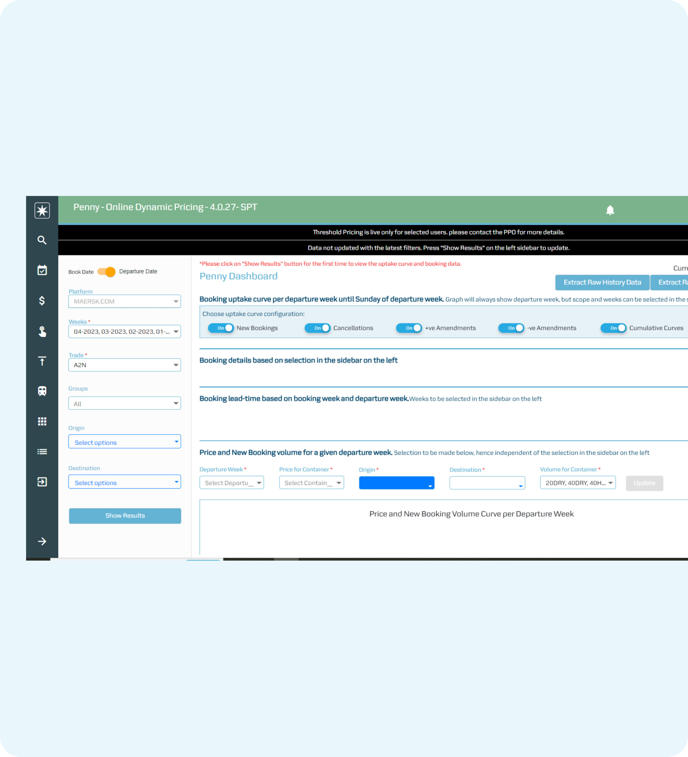
Screen: Dashboard

Key Issues observed
CTAs not as per MDS
Primary & secondary interactions are not clearly displayed. It leds to confusion in users. The input fields used to display visualization are not consistent.
Error message displayed
The status message is shown incorrectly irrespective of type of user action
Left filter elements consuming more space
The filters are used as user input to display visualization graphs. Graphs not displayed on their own.
Screen: Booking

Issues observed
Inconsistent UI
Unwanted collapsible section with Input fields inside that.
Booking search
User needs to move out of Dashboard to do Booking search, making an additional click
Whitespace
Lots of unused whitespace on the right
Affinity mapping
Once all the issues and success scenarios are measured, I created the Affinity mapping to come up with the different themes to present with stakeholders for further product roadmap. View the detailed Heuristic report

Themes evolved
System feedback
No clear communication to users for system time out instead of displaying blank screen, waiting state, upload pricing data and success message
Aesthetic design
Legacy product developed with no proper alignment and visual mismatch with Maersk Design system
Less flexibility
Users need to use three to four tabs to Search for different datas like Booking summary, Manual pricing, and few more details
Research goal
Tasks that focused on core functionalities of PENNY pricing analytics were evaluated. The goal was to identify major usability flaws within PENNY UI
- How efficiently Pricing managers can set up their day-to-day pricing for ocean cargos?
- What aspect of the product work well for the users?
- Validate key areas of improvement that needs immediate improvement
Research
The themes evolved in the design audit also gave me a direction of what additional I need to learn from the user group to validate my findings. So I created a list of questionnaire and conducted User Interviews with 30+ Pricing managers.

Persona
Adam works as a Pricing Manager with over 5+ yrs of experience. He is from Panama. His goals are to generate more revenue and generate more demand based on incoming booking volume

Insights
Update search
Having one integrated global Search feature, at the top of page combining 4 separate search items in navigation
System message
Unification of system messages – Info & Error, with clear communication for Timeout, or any other edge cases
Notifications
Implement a notification feature which will allow pricing managers to set rules for pricing conditions for their respective trade route
Before
- Cluttered UI
- Multiple steps to view visualization
- No clear system message
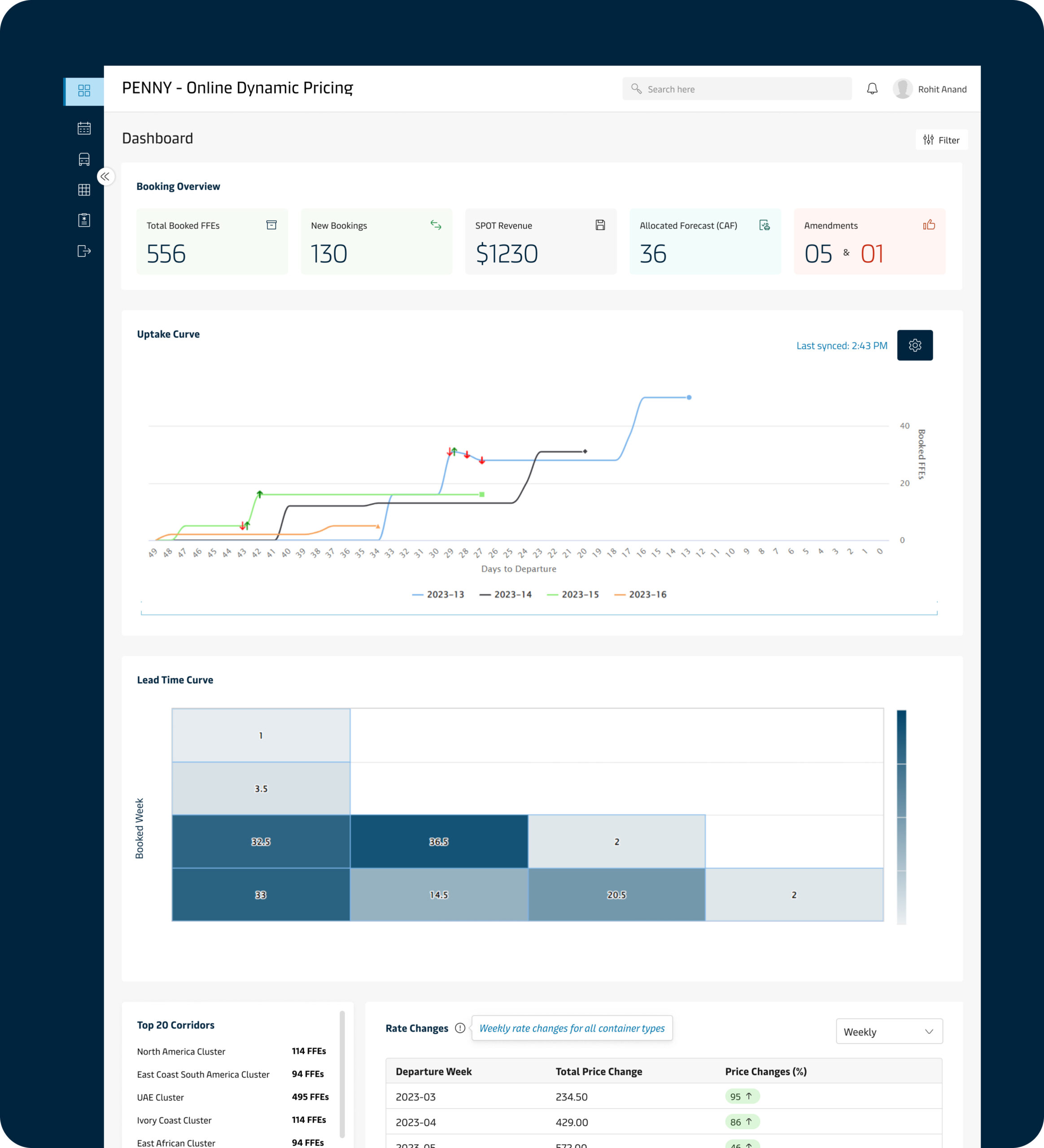
After
- MDS aligned UI
- Visualization displayed upfront based on RBAC model
- User gets notified for any pricing changes to be made
Task flow

Visuals

Notification hub
The Notification hub was a new feature I designed as a part of user request that came out as a theme & insight from user research. It helps pricing managers with
- Prompt notification related to pricing strategies satisfying concerns like System generated message
- Create business rules at route level leading demand for incoming booking


Impact & user testing outcomes
8/10
Zero errors while saving
15% quarterly
Increase in revenue
”>5
Task success rate
Learnings
- Learned to get stakeholder buy-in to improvise the legacy product UI
- Got to learn more about the product features with developer collaboration
- Recommended grouping of related features like Search, integration of Notification